BACK TO HOME

Bull Stock - Learn. Invest. Grow.

A beginner investing app for recent graduates. Built from interviews with new investors, it lets people learn the stock market and practice with mock money before risking their own.

ROLE
UX/UI design, from research and wireframes to the final screens, in collaboration with my team.
TEAM
Team of three
TIMELINE
4 weeks, Fall 2025
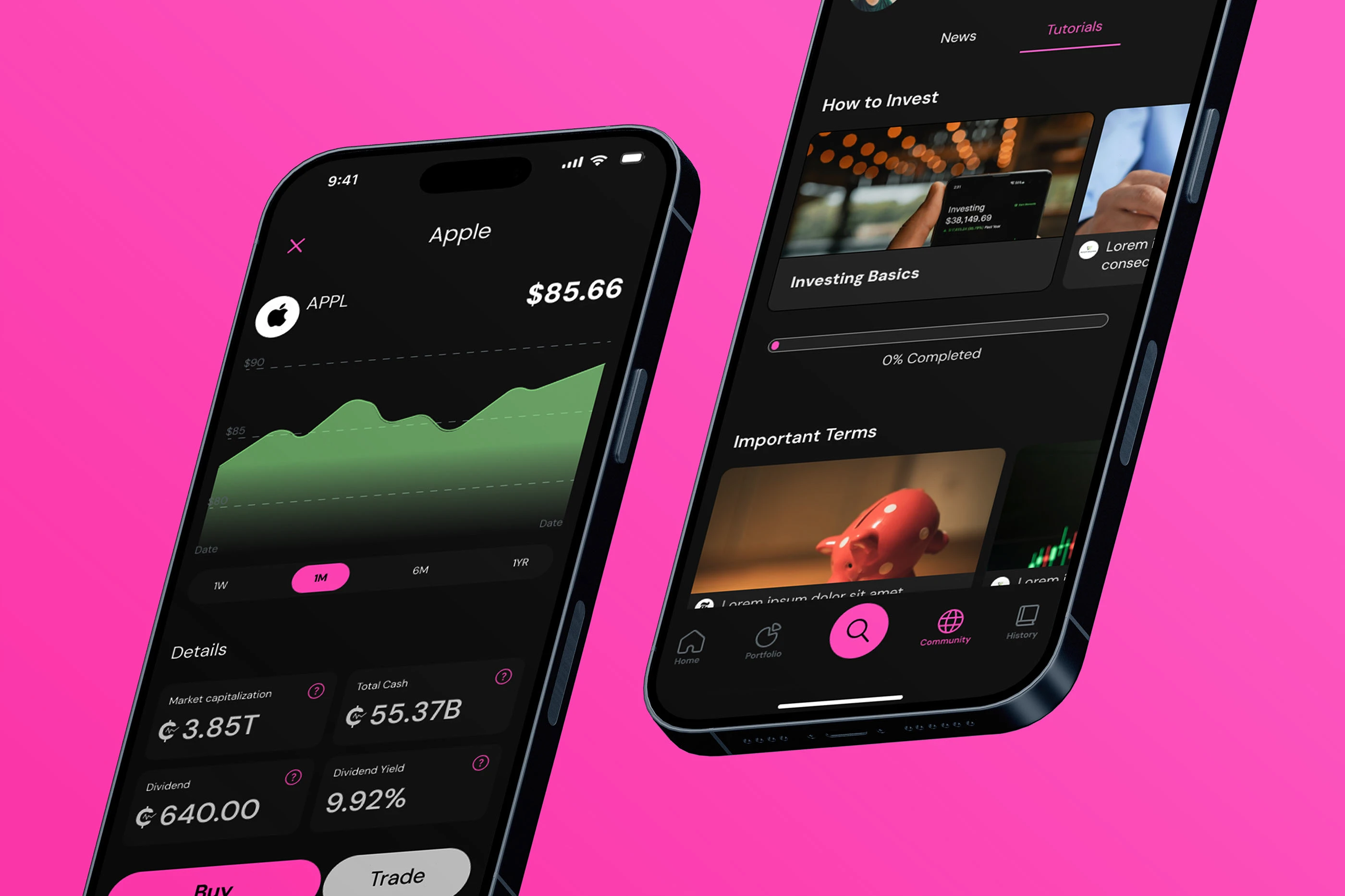
Two phones showing Bull Stock’s stock detail and tutorials screens on a pink background

Recent graduates want to invest, but the stock market feels like gambling with money they barely have.

Research

Our brief was open: pick an audience in fintech, find a real struggle, and design for it. We chose recent graduates entering the stock market for the first time, and set four goals for our research.

  1. 01Understand what users need when entering the stock market
  2. 02Understand how they currently learn about the market and start investing
  3. 03Understand the pain points of recent grads who invest
  4. 04Understand their perceptions and goals around the stock market

Secondary research

Studies on Gen Z investors: where they learn, what holds them back, what they want from a platform.

Competitor review

Eight investing apps, from Robinhood and Acorns to Fidelity and Webull, compared for how they treat beginners.

Interviews

Conversations with recent grads about how they see the market, their goals, and what scares them.

Current thoughts on investing?

Recent graduates feel overwhelmed and intimidated by the stock market. Investing feels a little like gambling, and on a limited budget they don’t want to risk money on something they don’t understand.

  • “I want to invest, but I’m scared of losing money I barely have.”
  • “I want to invest, not gamble. But I can’t tell the difference.”
  • “I feel anxious about investing because it is too risky.”
  • “Having a community (with the stock market) is crucial to me.”
  • “I don’t understand any of the trends.”

Who we designed for

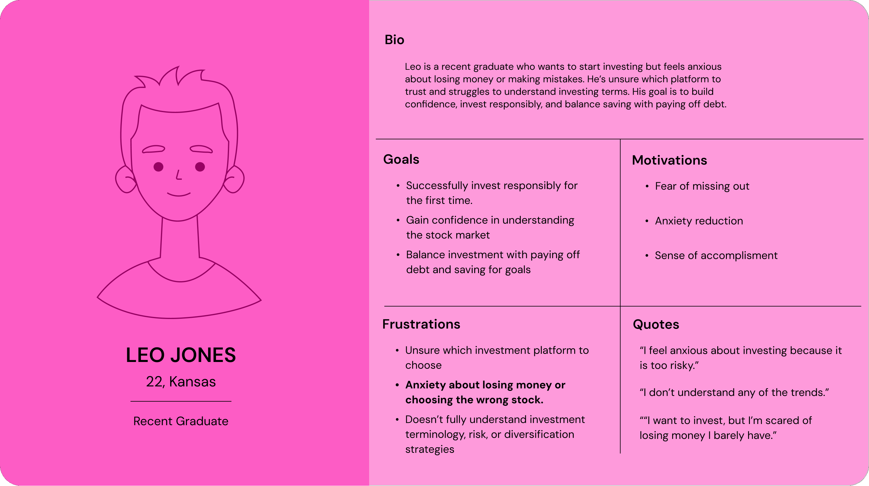
Leo is our persona: a recent graduate with a first job, student debt, and no confidence with investing terms.

User persona card for Leo Jones, 22, a recent graduate from Kansas, with his bio, goals, motivations, frustrations and quotes

User journey

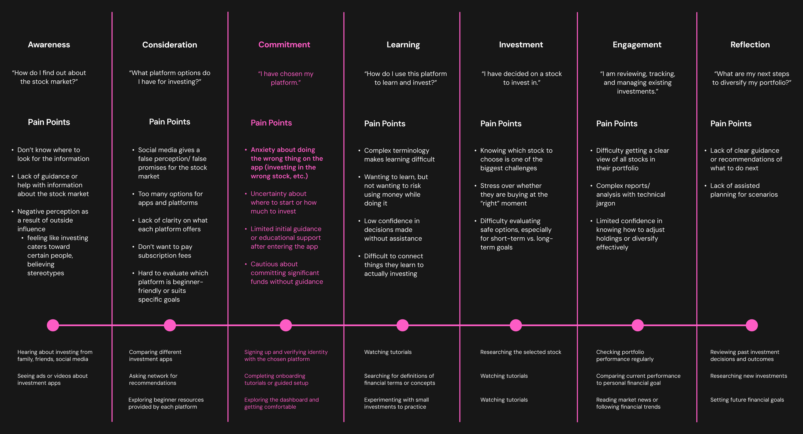
We mapped the path from first hearing about investing to managing a portfolio. The sharpest pain came right after downloading an app.

Journey map with seven stages: awareness, consideration, commitment, learning, investment, engagement and reflection, each with pain points and actions. Commitment is highlighted in pink.

PROBLEM STATEMENT

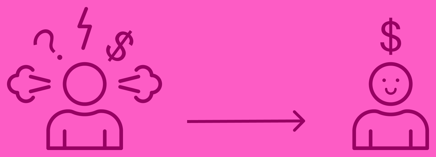
How might we reduce fear and anxiety, and build confidence for beginners to safely experiment with stock market investing?

An anxious figure surrounded by question marks, with an arrow to a calm figure under a dollar sign

From research to design

Each core feature answers something we heard.

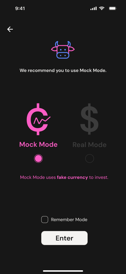
Mode screen recommending Mock Mode, with Mock Mode selected

“I’m scared of losing money I barely have.”

Mock Mode

Practice with mock coins first. Switch to Real Mode when you feel ready.

Stock detail screen for Apple with question marks beside each statistic

“I don’t understand any of the trends.”

Jargon explained in place

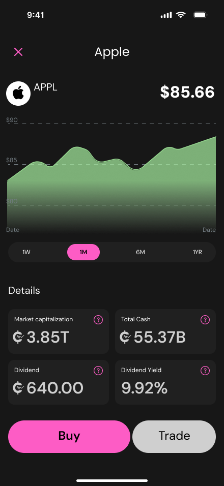
Question marks beside terms like market cap and dividend yield open a plain-language explanation.
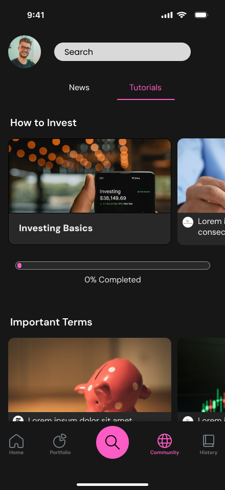
Community screen on the Tutorials tab, with How to Invest lessons and progress

“Having a community is crucial to me.”

Tutorials and community

Short lessons with progress tracking, next to news and a feed from other investors.
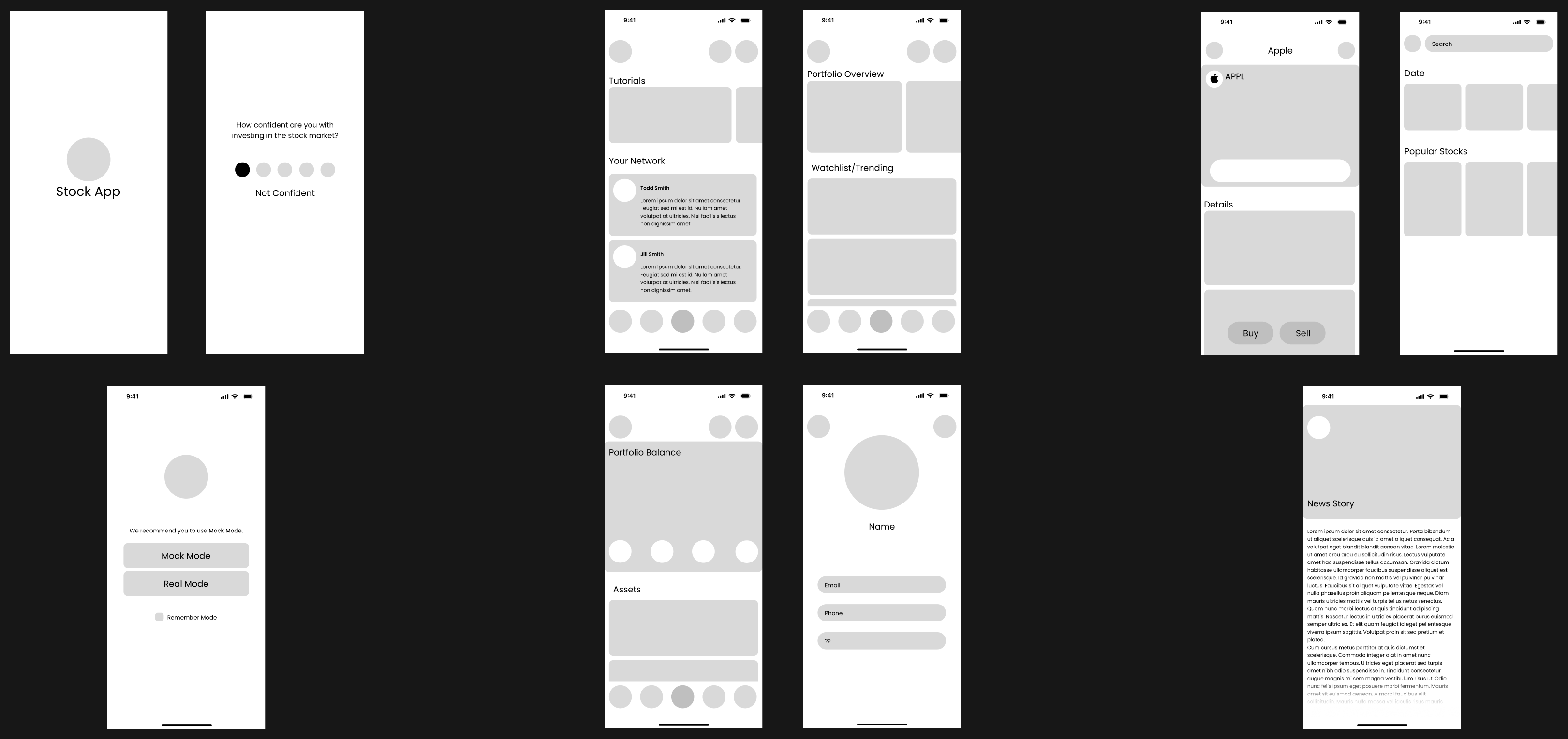
Wireframes

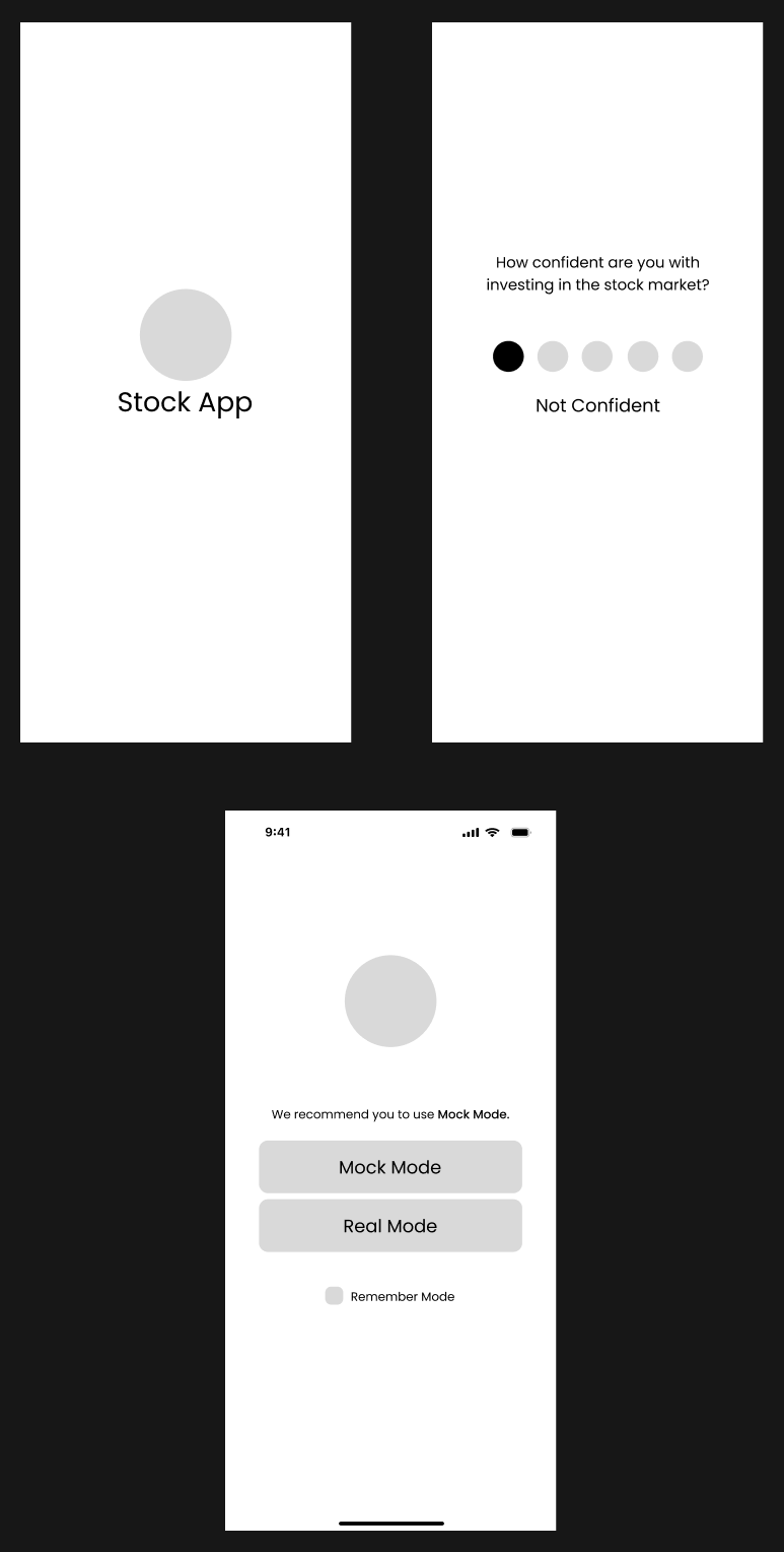
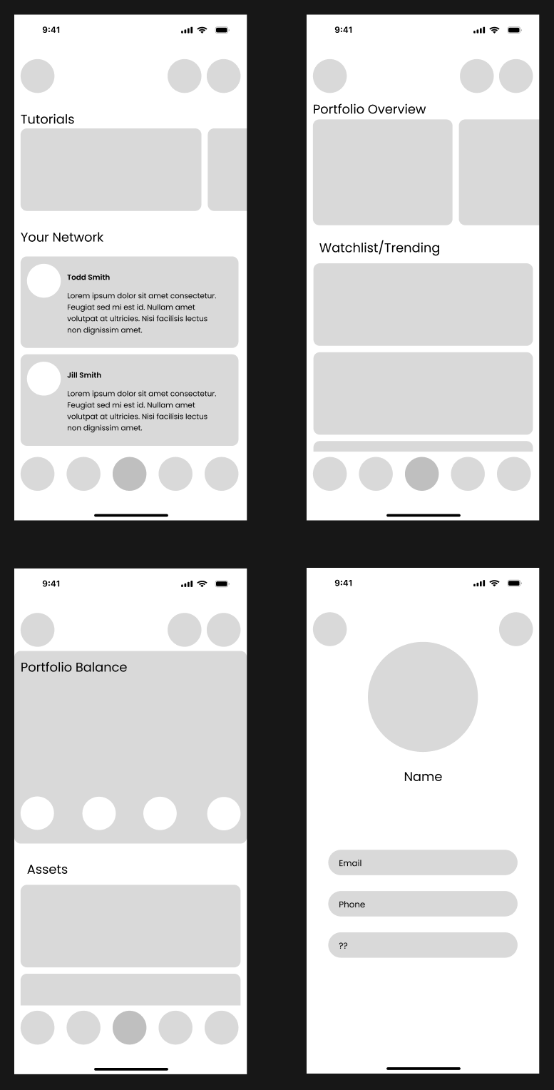
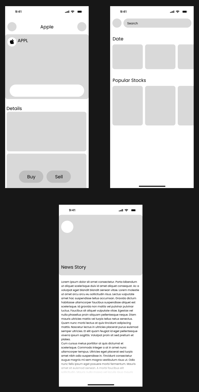
Early gray-box wireframes for onboarding, mode choice, home, portfolio, stock details and profile
Wireframes for onboarding: welcome, confidence question and the Mock Mode recommendationWireframes for the home, community, portfolio and profile screensWireframes for stock details, search and a news story

Initial prototype

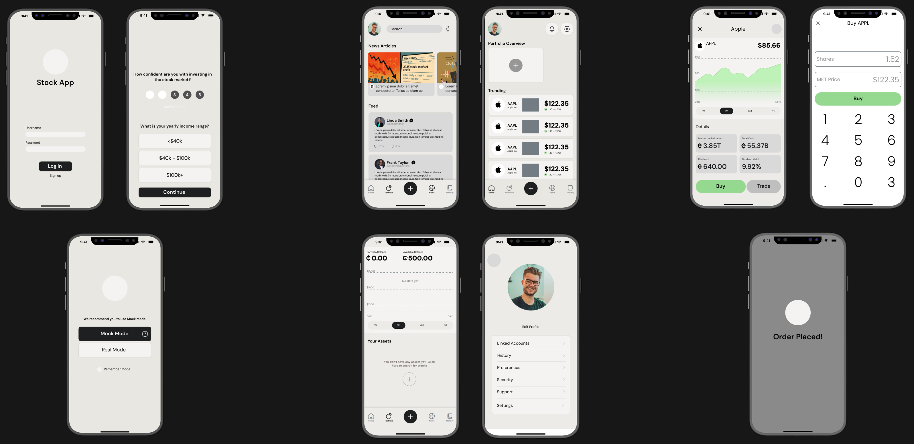
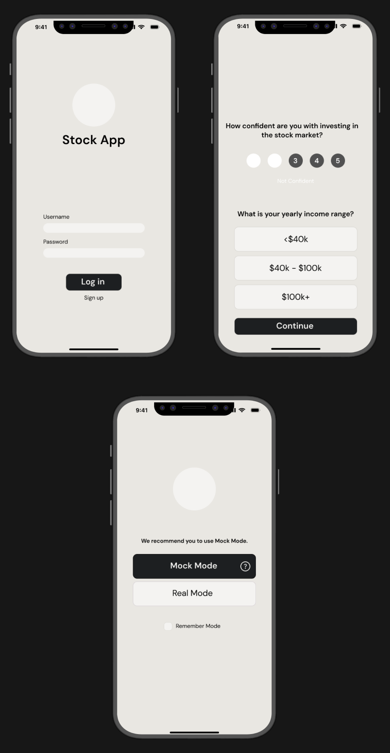
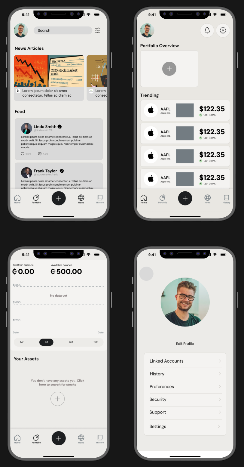
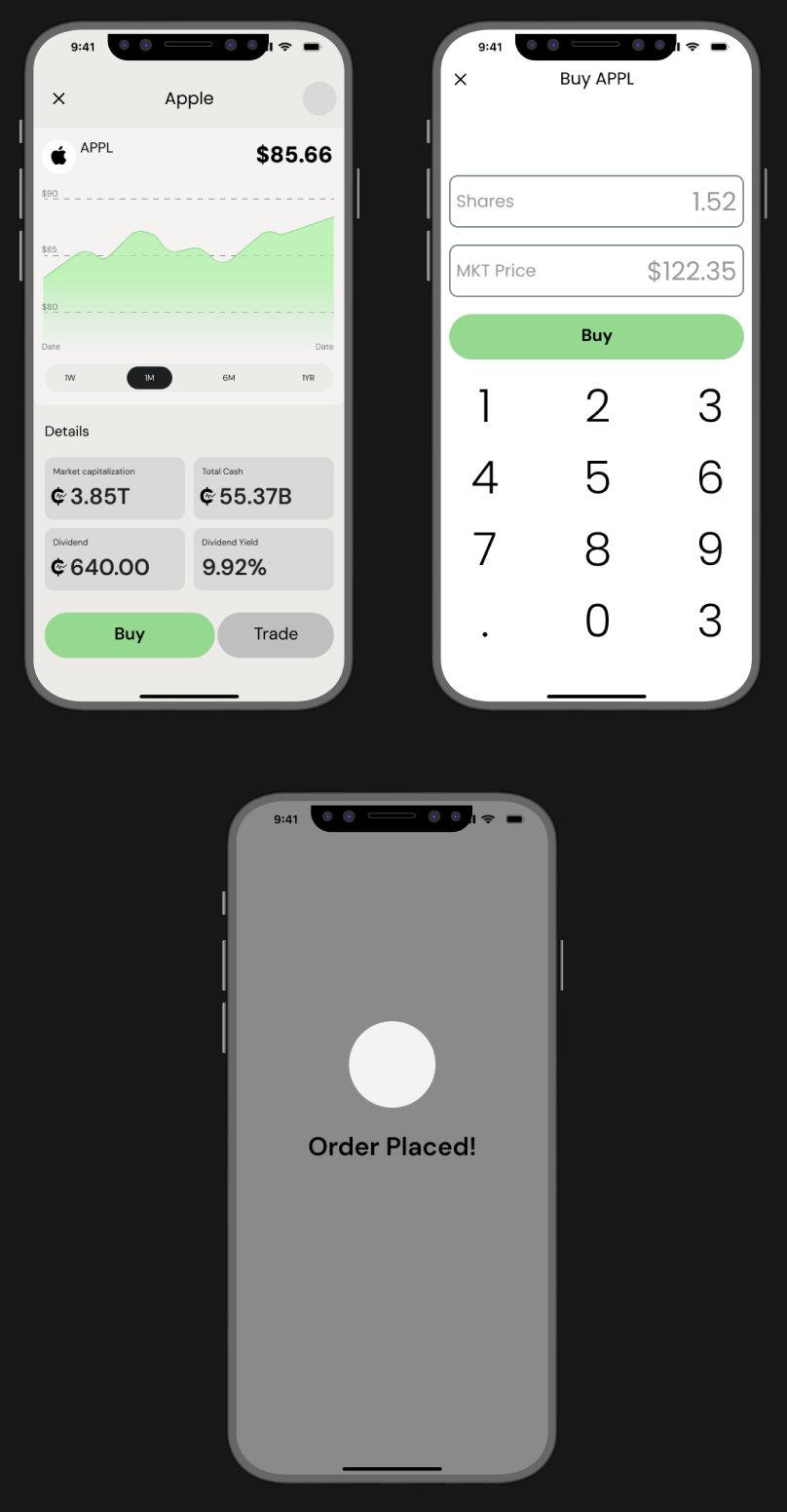
The first clickable prototype in light gray: login, questionnaire, mode choice, community, home, stock details, buy and order placed
Initial prototype onboarding: log in, questionnaire and mode choiceInitial prototype community feed, home, portfolio and profile screensInitial prototype stock details, buy screen and order placed

What testing changed

We put the prototype in front of users and fixed what tripped them up.
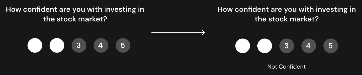
Before and after: Confidence scale

Confidence scale

On the questionnaire, the 1–5 confidence scale had no labels, so the numbers were open to interpretation. We added a label under the scale.
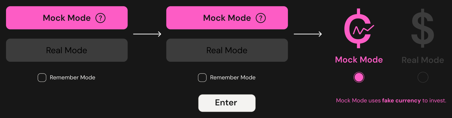
Before and after: Choosing a mode

Choosing a mode

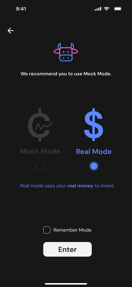
Tapping Mock or Real Mode used to enter the app straight away, which left room for error. We added an Enter button, then made the two choices look clearly different and explained what each one means.

Before and after: Knowing which mode you’re in

Knowing which mode you’re in

Color alone (pink for Mock, blue for Real) wasn’t enough. A “Mock Mode” or “Real Mode” label now sits at the top left of the screen.

Before and after: Finding tutorials

Finding tutorials

People weren’t sure what the boxes at the top of Home were, or that there were more. We added a “Tutorials” label and moved “See all tutorials” to the top of the row.

Before and after: Search, not add

Search, not add

The center button searches for stocks and adds them to a portfolio. Testing showed “search” is the first thing people do there, so the plus became a search icon.
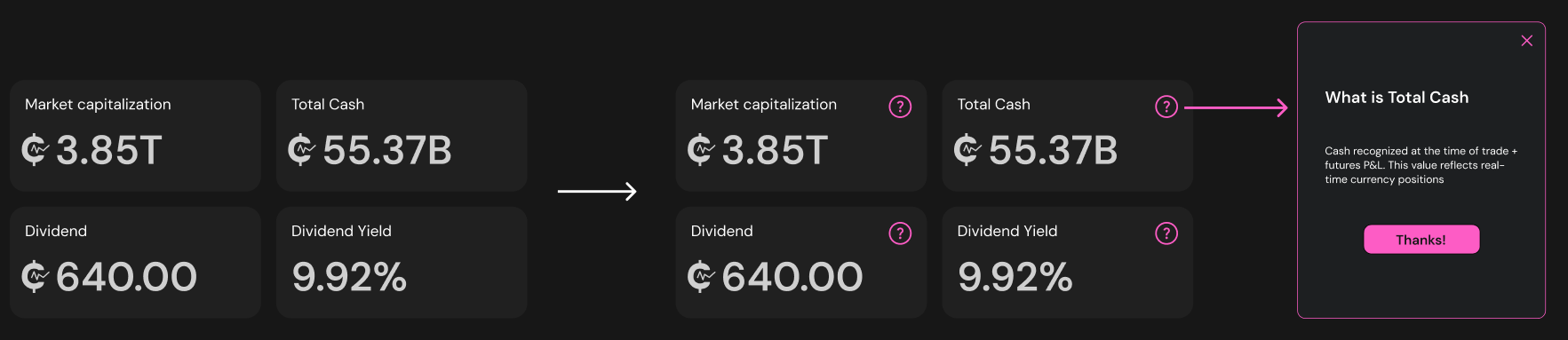
Before and after: Explaining the jargon

Explaining the jargon

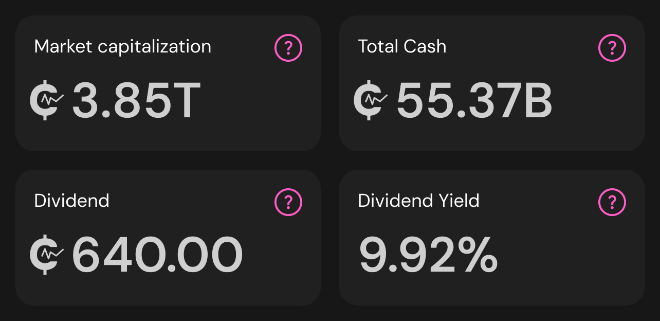
Terms like market capitalization and dividend yield confused new investors. Each box got a question mark that explains the term in place.

Before and after: Tutorials in Community

Tutorials in Community

Tutorials were buried in the profile. They now live in the Community tab, next to News.

Before and after: Showing progress

Showing progress

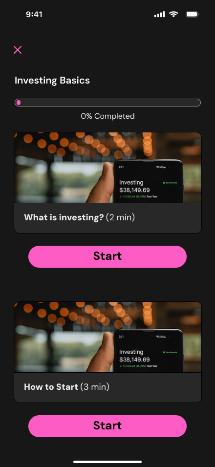
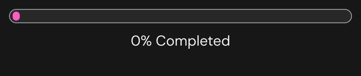
Tutorials gave no sense of how far along you were. We added a progress bar and a “percent completed” label.
Final design

Getting started

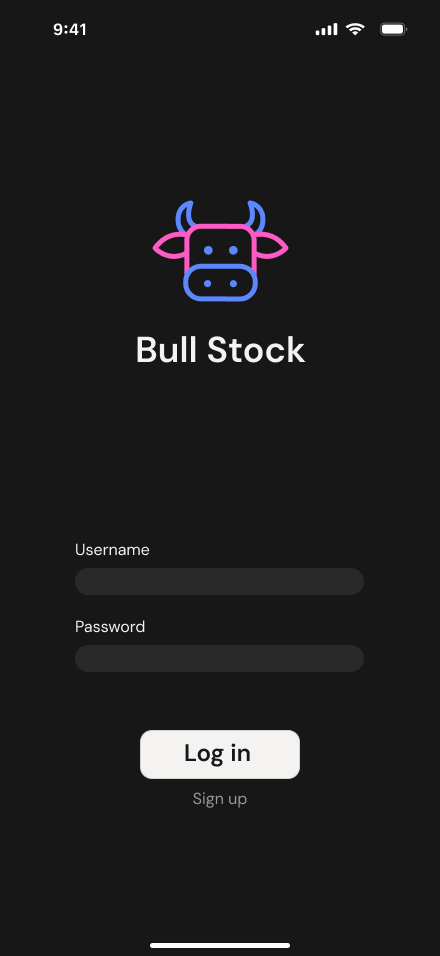
Login screen with the Bull Stock logo
Log in
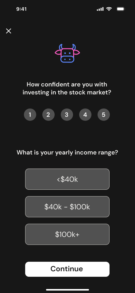
Questionnaire asking how confident you are with investing and your income range
A short questionnaire sets your starting point
Mode choice screen
Mock Mode is recommended for beginners
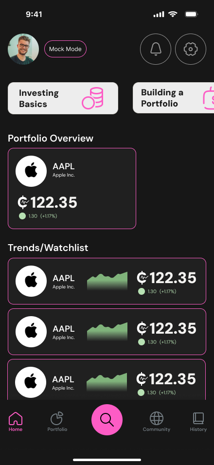
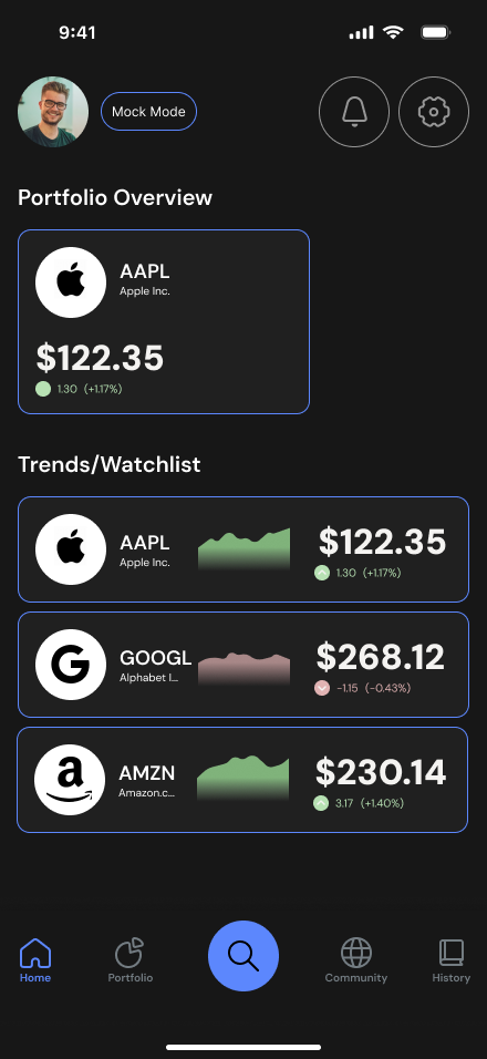
Home screen in Mock Mode with tutorials, portfolio overview and watchlist
Home, with tutorials up top

Investing

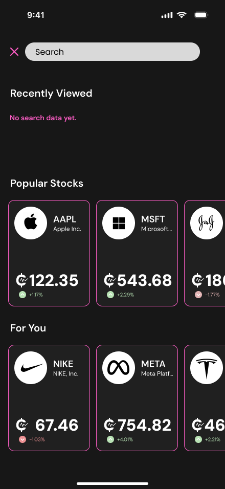
Stock list with recently viewed and popular stocks
Search and browse stocks
Stock detail screen with chart and explained statistics
Stock details with terms explained
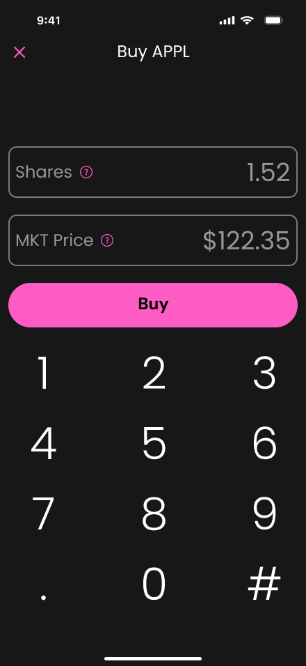
Buy screen with a number pad
Buy with mock coins
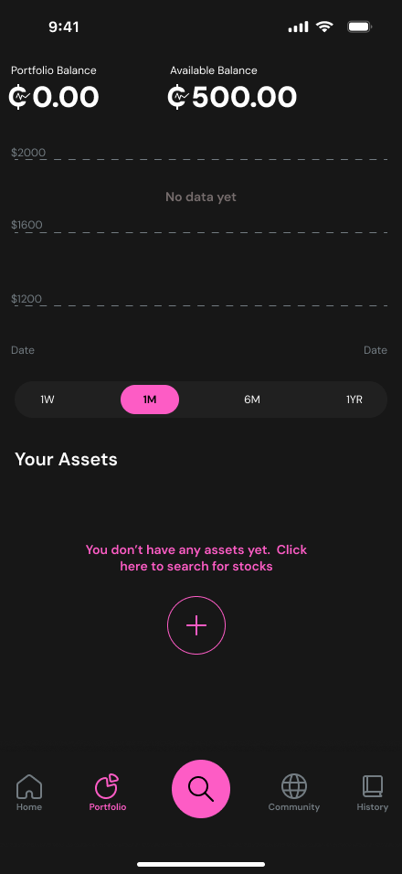
Portfolio screen with total and assets
Track your portfolio

Learning

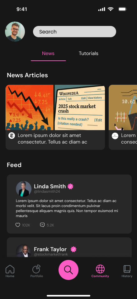
Community screen with news articles and a feed
Community: news and a feed
Tutorials tab with lessons and progress
Tutorials with progress
A tutorial video screen with a Take the Quiz button
Lessons end with a quiz

Real Mode

Mode screen with Real Mode selected in blue
Switching modes
Home screen in Real Mode, in blue
The same app in blue, using real money

FIGMA PROTOTYPE

CODE PROTOTYPE

After our group project ended, I rebuilt our designs on my own as a working, refined prototype using Claude Code. I made a few small changes to interactions and swapped the Mock Mode icon, but kept every research-driven decision the same.

Design system

Logo

Color

  • Mock Mode
    #FD5CC5
  • Real Mode
    #5C87FD
  • Background
    #171717
  • Text
    #FFFFFF

Type

DM Sans

Semibold for headings and numbers

Regular for body text and labels

Buttons

Primary pink Buy button beside a secondary gray Trade button White Continue button White Enter button

Mode selector

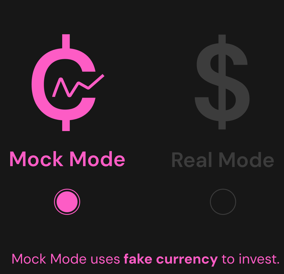
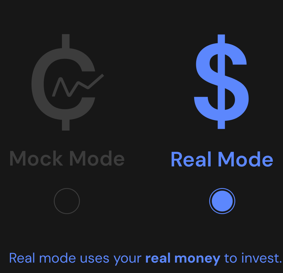
Mode selector with Mock Mode active in pink Mode selector with Real Mode active in blue

Inputs

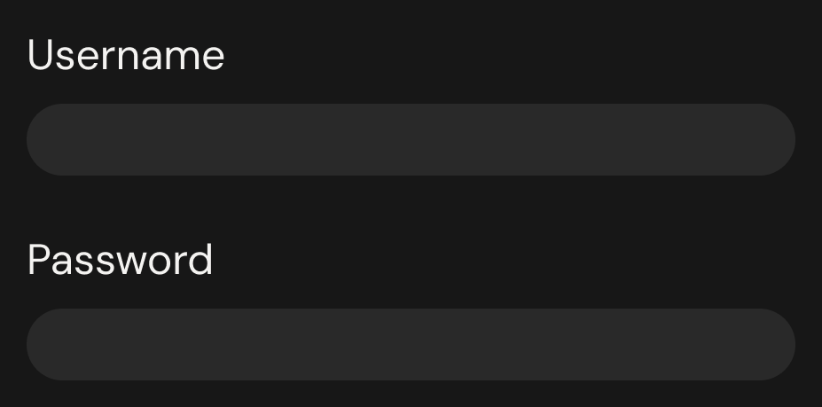
Username and password fields Search field Remember Mode checkbox

Selection

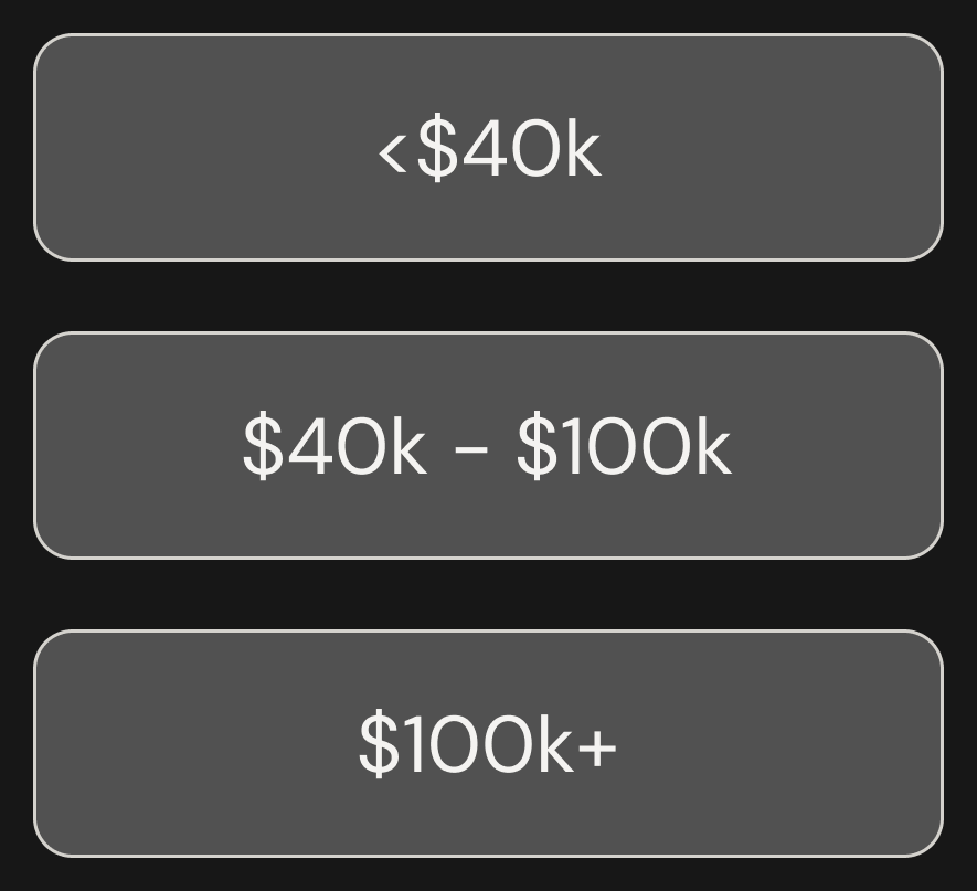
Confidence scale from 1 to 5 Income range options

Navigation

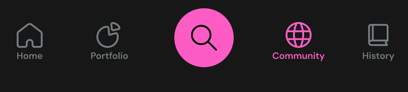
Bottom navigation with Home, Portfolio, search, Community and History News and Tutorials tabs Time range chips: 1W, 1M, 6M, 1YR

Data and progress

Stat cards with a question mark that explains each term Tutorial progress bar at 0% completed

Reflection

What we set out to do

Our goal was to ease the anxiety recent grads feel about entering the stock market. We built an app that puts learning within easy reach and makes a confusing topic feel calmer.

What I’d do next

Looking back a year later, I’d rework the visual design. The contrast is a bit high, and I might explore a different style if I were the only one working on it. I feel confident in the UX, though, because every decision traces back to research. In the end, though, there are always improvements to be made with more user research.
See more projects